Front Row + Bluetooth + K750i = !
120 days ago
 Apple recently released a new app called Front Row that lets you control your Mac from across the room by means of a big chunky, yet über-minimal interface and their new (again, almost excessivly minimal) remote control hardware.
I was curious to try it out and so when it was brought to my attention that you could install Front Row on any Mac, I thought I’d give it a go.
With all installed and working I faced just one minor drawback: I had to sit at my keyboard to use it, as sadly I have no Apple remote, let alone an infra-red receiver thingamajig to point it at! Experiment over I thought. :(
That is until this evening when I stumbled across a Front Row remote control for my K750i! To install it just download the file, unzip, then Bluetooth it to the root folder of your phone.
Hours of fun ensue! :)
Anybody found this useful?
Bassically... [sic]
221 days ago
 I’m in love… yesterday I was in Denmark Street, shopping for some bass strings and accidentally discovered my next bass!
I intentionally don’t have a massive collection of guitars, favouring the “one instrument per purpose” approach. I already have a gorgeous Music Man Stingray as my “normal bass” so I’m going to have this new Fender Jazz de-fretted.
I just can’t get over how beautiful this instrument is. The lack of scratch-plate (I never use a pick) and absence of volume/tone control plate make the design really un-fussy. Also the cream inlay around the rim of the body, plus the general iPod nano colour scheme ;) ...and it being fretless too: just wow!
Time for simplicity
237 days ago
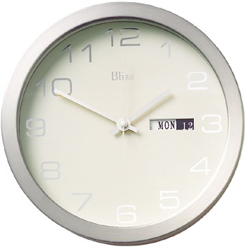
 I’m bored of looking for a clock. I’ve been looking for one to adorn my bedroom wall for around three years now and have to conclude that the vast majority of clocks out there are rubbish ...honestly. From a design point of view, clocks always seem far too fussy.
So I started thinking about all the things I like and dislike in clocks and have come up with a design that answers all these points.
My clock has to have
- no designer’s logo
- no fancy or poncey fonts
- no cheap looking hands
- if possible no parts standing proud
- good build quality
- natural materials
- good contrast and legibility
- a minimal design approach
In keeping with the minimal approch I christened it “Cherry maple clock”. Now all I have to do is have it built!
Apostrophe hell
267 days ago
I’ve just started reading Eats, Shoots & Leaves by Lynne Truss. Her book details, through rather good humour, the annoying misuse of punctuation that’s widespread nowadays.
Like her, I aim to always use the correct typographic quotes (including on the web!) and usually pick out incorrect use of apostrophes (its versus it’s etc.). However I think perhaps I can top her efforts at “pointless attention to punctuation detail”.

Dilemma
This one has bugged me for a while: what’s going on with the apostrophe on Earl’s Court tube station? Also Barons Court doesn’t even have one! Most other stations do have apostrophes where you’d expect but it seems that the Earl’s Court one was a recent addition.
You can tell as all the apostrophes on the station’s signs are at slightly different heights (modelled here by Neil, guitarist in my band). Despite this, the bit that really annoys me, is they’ve all been stuck on 45 degrees wrong!!
Typographic history lesson
The New Johnston Typeface was specifically designed for the London Underground in 1913. It was one of the first widely used sans-serifs and has survived to this day, solely in use by Transport for London.
What a brand… a gorgeous font, an über-minimal logo and the best map design in the world, bar none.
New Johnston is legible, instantly recognisable, and has one subtle, but beautifully quirky design feature: the dots on its letter “i” are squares turned through 45º.
Adding insult to injury
Following suit, the apostrophes and commas are also squares tilted through 45º, with one face extended to become the tail.
Obviously the person sticking on the Earl’s Court apostrophes completely glossed over this beautiful, almost definitive quirk of the typeface! Aaaaarrrrggh!!!
Mandala release two EPs!
302 days ago
 Mandala have just released “Before Memory” and “The Tears of a Thousand Angels”: sister EPs that contain our best recordings to date. We’ve been together for over seven years so something must be right by now!
More info can be found on my band’s news page. They are for sale at a mere £5 each or just £8 for the pair.
We played at the Bedford in Balham (in South London – a fantastic venue) last night to launch the EPs. Our violinist couldn’t make the gig, but luckily we had a stand-in. Anna was just fantastic, she picked up her parts in a single backstage run-through and went on to play an intense set. There are videos of a few songs which we hope to get onto the site soon.
Elliot was on hand to do our live photography, and I also took along a light and set up a makeshift photo-studio in the green room.
My shots are slowly becoming a press shot for the band, the progress of which can be seen here and then a little more refined here.
The resolution is intense, the shots I’ve submitted to deviantART are only around 25% actual size!